Shock and Awe
The first approach for a redesign of IMO’s Epic integration, eSMART
These low and medium fidelity artifacts ( below, right ) capture my very first redesign direction, a most RADICAL departure from what we had. Effectively boiling down the product’s functions to a bare-minimum, easily-consumable summary page. Instead of scrolling and scanning, the user would either trigger a bulk cleanup per group, or click through to explore each group and proceed with greater specificity.
The Product Manager’s reaction was gracious but strong: First, he insisted, that even though eSMART would always open in Epic next to the patient’s problem list (PL), it was vital to additionally retain the context of the patient’s full PL in eSMART. Second, he insisted doctors, as a persona, were notorious for “counting clicks” and for disparaging software that seemed to require too many.
I was new to IMO at the time and it was vital I build rapport with my product manager. And I had come to appreciate Mr. Arco’s vast industry knowledge as well as his patient tutelage. So I didn’t balk.
Looking back, however, I would have loved to have had the chance to test this design. Often, an experienced designer’s very first instinct is the right one and the merits of this approach, in retrospect, stand out in rather stark relief to at least one other we ended up chasing down a rabbit hole.
Why?
First, as I’ve described, the user would ALWAYS have the patient’s PL in context. did we really need to reproduce it in eSMART, some 600 pixels to the right?
Second, while Arco wasn’t wrong about doctors noticing clicks, there were two things wrong with that pushback: First, for the existing version, and ANY version of eSMART, clicks were already inevitable. Such versions would invariaby invite consideration of potentially long lists and inevitably require clicks for taking action on an interspersed sub-set. Second, it’s well-established UX theory that clicks get noticed much less when they’re logical and keep the user in their flow.
As mentioned, the Product Manager, Mr. Arco, dismissed the above design direction out of hand. Which was absolutely his prerogative. After all, eSMART was his product.
While I was not able to demonstrate this design’s value, I really had no opportunity to do so, either. As I’ve described, there was no infrastructure in place for testing design direction with actual users. And access to such users would have been necessary to validate my hypotheses around eSMART’s use in the Epic context.
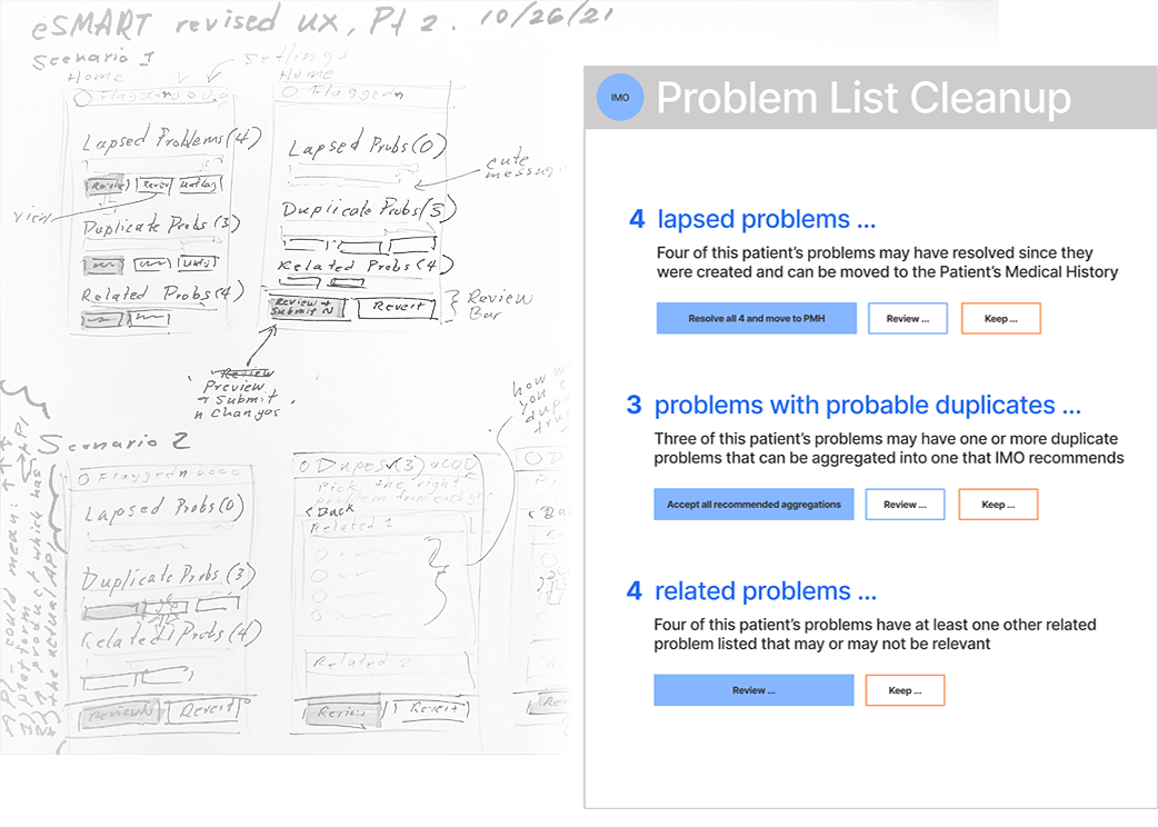
This design direction absolutely got noticed, however, and earned me a “kudo” award from a colleague who had experience working within Arco’s constraints. At the very least, the shock and awe created by this design signaled to Arco that I wasn’t here for a nip-tuck of eSMART. And that he should expect bold ideas in pursuit of solving eSMART’s adoption problems.
That there was, manifestly, a new UX sheriff in town.
Pardner.