Gloor Product Design
 

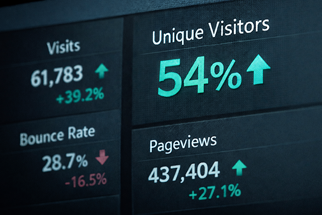
Unique users up 104% in redesign of Fitch Ratings’ Research Platform

Along with Moody’s and S&P, Fitch Ratings assesses the creditworthiness of debt issuers like banks and governments.

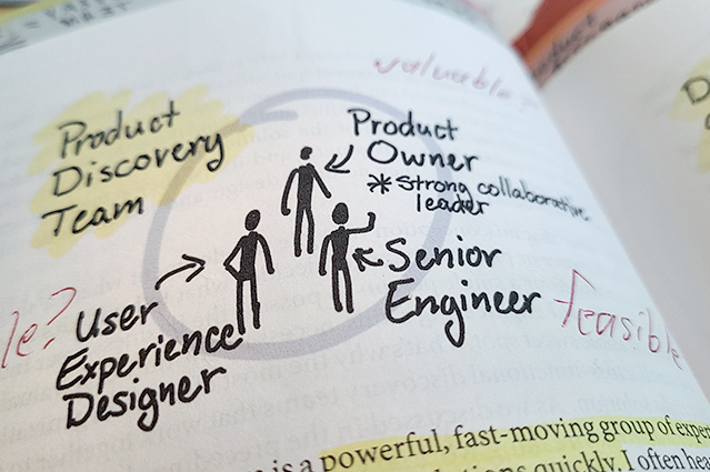
Digital products used in this space are complex and industry-specific, very much tailored to the particular needs of a unique kind of user. Which means they require serious Product Design.

This is what Fitch Ratings came to understand about their enterprise research platform, FitchConnect. When it started bleeding subscriptions, they tried aiming a series of visual design experts at the problem. But the product’s issues were more than skin-deep. It needed a fundamental reconceptualization by a design leader with experience in research, usability, and crossfunctional collaboration.

Read the Case Study →


bg_art_fintech_14.png

Reconceptualizing Fitch Ratings’ Research Platform

Full Case Study →


Designing a clean, responsive UI

Fitch’s product needed way more than a facelift. But its old look was not helping matters either. So I revamped the aesthetic and made the UI responsive.

Read More →


Navigating Wall Street culture

Talking design with product leaders can be tricky when they all work a city away, breathe the rarified air of Wall Street, and trust mainly other financial people.

Read More →


Solving the real problem

Fitch leadership thought usage was dropping because their product was ugly. It was, but that wasn’t the root problem.

Read More →


Building a UX team in Chicago

How do you build a functional UX practice from nothing? As a certified UX Manager, I knew who to hire and how teams should interact.

Read More →


EDI Solution surpasses IBM’s to rank second in market

EDI stands for Electronic Data Interchange. It’s how many partnered businesses talk to each other. To accomplish things like order fulfillment and shipping.

Software in this space is complex and industry-specific. Which means creating it requires a lot of business and technical expertise common to the industry. Which, unfortunately, can make for a lot of overlap in functionality across competing solutions.

So how do you stand out in this market? What would differentiate a new EDI solution from Cleo Communications? My design focused on the user’s experience.

I was able to make that case to Cleo for two reasons. First, I make it my business to understand the business — especially the customers. And second, because I take design where few creatives dare to tread: The boardroom. And into the lion’s den of technical teams, who are often impatient with the concept of bending their hard work around user need.

This is how I designed Cleo Integration Cloud (CIC), the second most popular solution in the EDI space, recently surpassing other big league players like IBM. In the eight years since it shipped, CIC has quadrupled Cleo’s enterprise valuation.

Quadrupled.

Read the Case Study →


bg_art_bigboat_04.png

Designing the second most popular EDI solution on the market

Full Case Study →


Ideating concepts that endure

Workflow Cleo promotes on its Web-site in 2026 can be traced to sketches I made in 2017. CIC’s concept model has endured since it shipped in 2018.

Read More →


Operationalizing design theory

A wealth of theory exists around how design effectively fits in to an enterprise product org. But implementing it took patience, savvy, and evidence.

Read More →


Negotiating trade-offs

Cleo struggled with old patterns of design ingestion. By bringing everyone in to the design conversation, I delivered the breakthroughs we needed.

Read More →


Designing to evidence

Whether it was guerilla testing my clickable prototypes, or getting quantitative data in support of a new aesthetic, I backed up all my design choices.

Read More →


First-try success rate soars to 85% in doc app redesign

Doctors don’t have time for help files. Quickly getting them into their workflow is vital to adoption in MedTech.

So when metrics revealed doctors weren’t using eSMART, IMO Health’s complex integration to Epic, IMO knew they had a problem. Because Epic is by far the most popular medical records system on the market.

After carefully researching the problem and closely collaborating with doctors, developers, and product management, I designed a prototype that showed a success rate of 85% with first-time users. No training. No documentation.

That solution shipped as-designed in 2023 and is currently helping doctors all over America treat their patients.

 
Read the Case Study →


bg_art_thoughtfuldoc_02.png
 

product designer

ERIK GLOOR

Hello, my name is Erik Gloor. Welcome to my portfolio of Product Design. I hope you find it a useful resource.

Together, we can take your new or existing product to the next level. We can give your users a product they can't live without.

Let’s get this adventure started.

Email Erik Gloor →